One usually wants to limit to a minimum their dealing with the tax man, or here in the UK, His Majesty Revenue and Customs (HMRC).
And it’s very rare that anyone would approach the HMRC website with a light hearth and a happy mind. Using any online service provided by GOV.UK is typically due to a need rather than pleasure.
Yet, when I had the privilege to use HMRC’s website (not due to any fault. Really!), I was quite fascinated by the experience. And I think that their web design principles are extremely interesting.
Transparency
It might be that in my native Italy the government web portals are never designed with usability in mind, but the HMRC website is well-designed.
And what is even more striking is that the British Government is very transparent about the principles it follows in its design process, in a clear effort to spread good practices and make things work. They even share a library with official examples of their HTML, CSS, and JavaScript code!
Based on Explicit Principles
The design principles followed by GOV.UK are detailed and robust. You can find them on the GOV.UK Design System website. These principles have been refined and expanded since their initial publication in 2012. Some highlights include:
- Start with user needs
- Do less
- Design with data
- Do the hard work to make it simple
- Iterate. Then iterate again
- This is for everyone
- Understand context
- Build digital services, not websites
- Be consistent, not uniform
- Make things open: it makes things better
These principles are not just guidelines; they are a commitment to creating digital services that are accessible, efficient, and user-friendly. For instance, the emphasis on user needs and iterative design processes ensures that services are continually improved based on real user feedback and data.
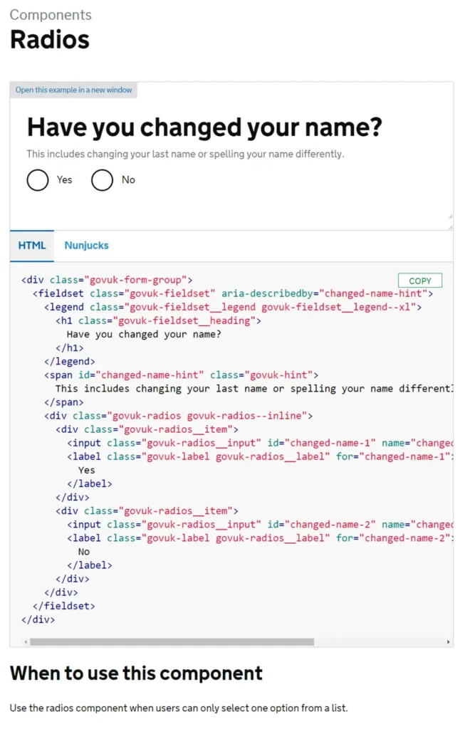
For example, here you can see tips on where and how to use a Radio Button component:

The GOV.UK Design System
The GOV.UK Design System is a comprehensive resource that provides reusable patterns, components, and guidance for designing and building accessible and consistent services. It includes:
Styles: Standardized CSS styles that ensure a consistent look and feel across all GOV.UK services.
Components: Pre-built, accessible components like buttons, forms, and navigation bars.
Patterns: Common design solutions for tasks like authentication, navigation, and user interaction.
Accessibility Guidelines: Detailed instructions to ensure that all services are usable by as many people as possible, including those with disabilities.
Who Can Use This?
If the ethos and user experience of the website you design/manage is similar to those of GOV.UK (i.e., need-related services), it might be worth a deeper look at the GOV.UK Design System. This is especially relevant for sectors like healthcare, insurance, or any other service-oriented industry.
Conclusion
The GOV.UK Design System offers valuable insights, resources, and inspiration for any web design and development project. It embodies principles that can enhance the user experience and accessibility of your services. As always, if you have any projects related to web design and development, please feel free to give us a shout or have a look at our e-commerce services.
References
Government Design Principles https://www.gov.uk/guidance/government-design-principles
GOV.UK Design System https://design-system.service.gov.uk/


